VoIP & Communication SaaS Platform
Project Overview
Product: Calilio
Platform: Web-based VoIP & Communication SaaS
Role: UI/UX Designer
Tools: Figma
Timeline: 2023–2024
Website: https://www.calilio.com
Problem Statement
Business users using VoIP and communication platforms often face:
Complex dashboards with steep learning curves
Poor visibility of conversations, calls, and team activity
Overloaded interfaces that slow down daily workflows
Inefficient navigation between messages, calls, and contacts
Calilio needed a clean, scalable, and user-friendly dashboard that could support:
High communication volume
Multi-user teams
Real-time messaging and calling
Fast access to critical information
My Role & Responsibilities
As a UI/UX Designer, I was responsible for:
Designing end-to-end dashboard UI in Figma
Creating user flows for messaging, calling, and contact management
Improving usability and visual hierarchy
Designing scalable components for future features
Collaborating with developers for design feasibility and handoff
Understanding the Users
Primary Users
Customer support agents
Sales teams
Operations managers
Admin users managing communication channels
User Needs
Quickly respond to messages and calls
Clearly see conversation history
Easily switch between contacts and team members
Manage numbers, tags, and reminders efficiently
UX Goals
Reduce cognitive load in high-volume communication environments
Improve readability and message hierarchy
Enable faster task completion
Create a familiar, chat-like experience with enterprise reliability
Design a scalable system for future features
Design Process
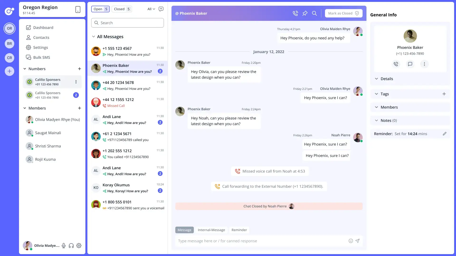
1️⃣ Information Architecture & Layout Planning
I structured the dashboard into clear functional zones:
Left Sidebar → Navigation (Dashboard, Contacts, Settings, Numbers)
Middle Panel → Conversation list & activity
Main Panel → Active chat / call view
Right Panel → Contextual user details & actions
This layout allows users to:
Navigate quickly
Keep context while switching conversations
Avoid unnecessary page changes
2️⃣ User Flow Design
Key flows designed:
Incoming message → reply → follow-up
Call received → call log → notes/reminders
Switching between numbers and regions
Assigning conversations to team members
All flows were optimized to minimize clicks and context switching.
3️⃣ UI Design & Visual Hierarchy
Key UI Decisions:
Soft color palette to reduce eye strain
Clear typography hierarchy for messages and timestamps
Visual indicators for unread messages, calls, and statuses
Avatar-based identity system for quick recognition
Status icons for calls, missed calls, and voicemails
The design prioritizes clarity over decoration, which is critical for enterprise SaaS tools.
4️⃣ Component & System Design
I designed reusable components such as:
Message bubbles
Call status indicators
Contact cards
Tag labels
Action buttons
Notification banners
This ensures:
Consistency across the product
Faster development
Easier future feature expansion
5️⃣ Collaboration & Handoff
Shared Figma files with developers
Used clear naming conventions and component structure
Ensured responsive behavior was documented
Worked closely with developers to align UI with technical constraints
Let’s work together
Have a project in mind? I’d love to hear your ideas and create something meaningful together. Let’s bring your vision to life.