Project Overview
Product: Talent Wars
Platform: Web-based Recruitment SaaS
Role: Product Designer
Tools: Figma
Timeline: 2023–Present
Website: https://talentwars.com.au//
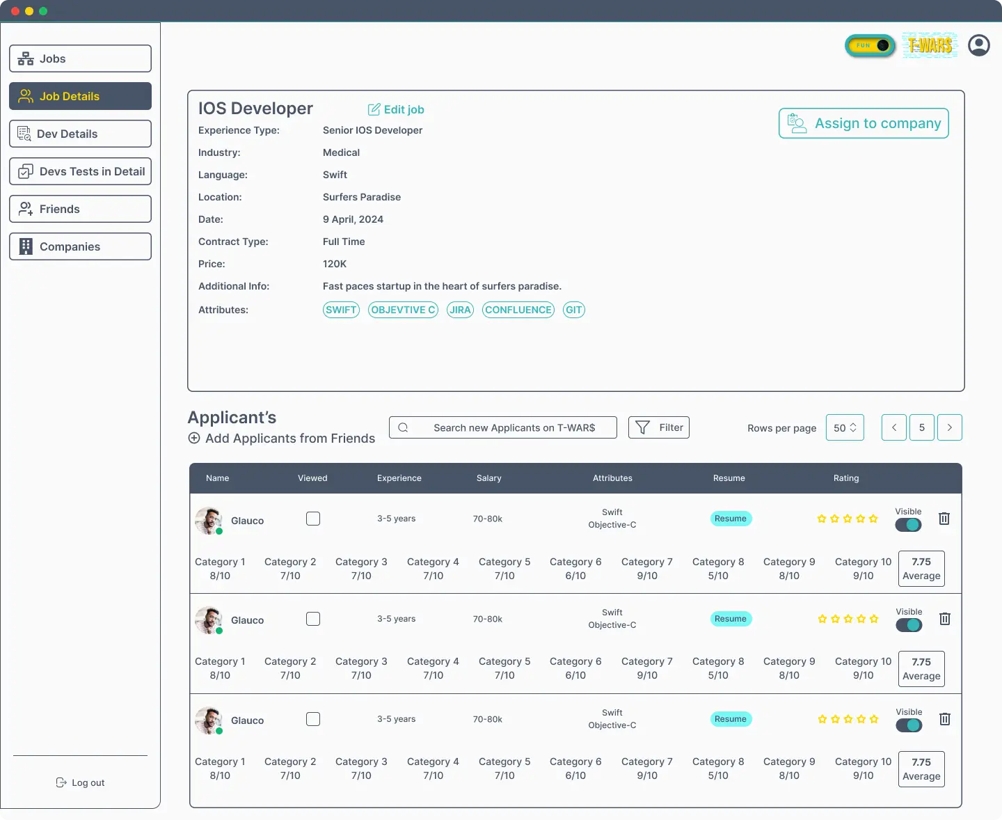
 Information Architecture & Layout Planning
The platform was structured into clear functional modules:
Left Sidebar → Navigation (Jobs, Developers, Tests, Companies, Settings)
Main Content Area → Job details, applicant lists, evaluation data
Context Panels → Candidate details, ratings, and attributes
This structure ensures users can navigate quickly without losing context, even when handling multiple job openings and applicants.
 User Flow Design
Key user flows designed:
Creating and managing job postings
Assigning jobs to companies
Reviewing applicants and resumes
Evaluating developers based on skills and experience
Rating candidates and managing visibility
Each flow was optimized to reduce unnecessary steps and make decision-making faster.
 UI Design & Visual Hierarchy
Key UI Decisions:
Clean, neutral color palette for enterprise credibility
Clear typography hierarchy for job data and candidate information
Data tables with strong alignment and spacing for readability
Visual indicators for candidate status, ratings, and visibility
Action buttons placed near decision points
The UI focuses on clarity and efficiency, essential for recruiter-heavy workflows.
 Component & System Design
Designed reusable UI components such as:
Job detail cards
Applicant table rows
Skill tags and attributes
Rating systems and score summaries
Action buttons and filters
This component-driven approach ensures:
Consistency across screens
Easier scalability
Faster development iterations
 Collaboration & Handoff
Delivered structured Figma files with reusable components
Maintained clear naming conventions and layouts
Worked closely with stakeholders to refine workflows
Ensured designs were developer-friendly and scalable